Last week, the New York Magazine brought ahead of schedule the publication of extracts of Fire And Fury: Inside The Trump White House by Michael Woolf after the Guardian newspaper leaked extracts. But what they also brought to the party, absent from Woolf’s text, were illustrations of some of the scenes portrayed in the book, by one Jeffrey Smith. One of which is on the cover of the print edition, out today.
Smith is an established and award-winning illustrator. As well as major advertising campaigns, he has specialised in recreating scenes, initially murder scenes but then many more topics for the likes of Los Angeles Magazine, Rolling Stone, G.Q. and The New York Times Magazine. He is a full-time Professor at the Art Center College of Design, where he has taught since 1994. He received a Gold medal from The Society Of Illustrators in New York in 2004.
I approached Jeffrey to ask about the assignment, and he was more than happy to talk about it – and share some of the procedures behind the pieces.
Rich Johnston: What laxity did you have in choosing the scenes to illustrate? How mandated were the moments?
Jeffrey Smith: First, I read the story. Then, the design director Thomas Alberty sent a list of scenes that the editors selected from the excerpt. I requested assistance with photo research and Sophia de Guzman, the photo editor really came through with excellent reference; easily one or two hundred photographs. I tried to contribute to this by telling her what kind of facial expressions, and gestures I was looking for. It was a bit of a back and forth process. There was absolutely no input regarding narrative composition, design etc. By the way, that’s the line I draw. If someone wants to design the picture, I walk.
Rich Johnston: You’re working, it seems, from photo reference, but building up scenes that could never have been photographed. What were the greatest challenges?
Jeffrey Smith: This is always the great challenge with re-creation assignments. Essentially, this is a portrait assignment. The faces of famous people tell the story. I create Photographic-Compositions in order to design and compose a good image.
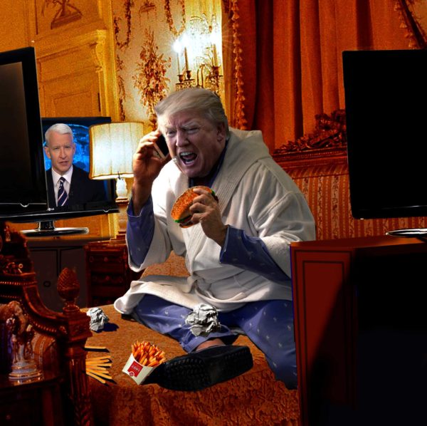
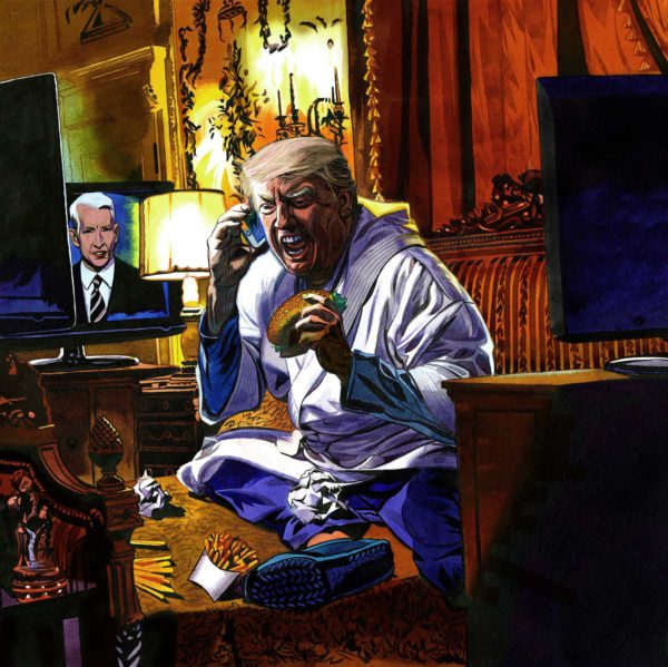
For instance, in the case of Donald Trump sitting on his bed while eating a cheese burger and screaming into the telephone; I needed 1) a portrait photograph of Trump yelling 2) A photograph of his bedroom 3) three televisions 4) Trump’s body 5) French fries 6) crumpled paper 7) Anderson Cooper 8) a cell phone 9) a cheeseburger. The photo editor provided a few good photographs of Trump yelling, and also several photographs of Trump’s bedroom(s).

I purchased pajamas and a robe and photographed myself in the pose that matched the portrait reference and the environment, holding a cell phone and a burger. The rest were props from Google images. Then I assembled the images in Photoshop, taking care to consider angle of view, angle of light, chiaroscuro, pattern, atmospheric perspective, tilted frame and framing. Anderson Cooper was a last minute idea on my part and no one objected. This was the picture that scared me the most. The way these pieces of imagery come together to make a whole scene; 1) Imagination 2) Visualization 3) Matching the figure with the environment 4) composition 5) design 6) luck or serendipity.

Rich Johnston: Trump says he never wore a bathrobe when commenting on previous media descriptions of his time in the White House. You gave him one, with his cheeseburger. Was that a specific note as to his reliability about himself?
Jeffrey Smith: Well, in fact, there are a few images online of Trump in a bathrobe. I checked it with the Design Director, and everyone was good with it. It was a non-issue, at least in my mind.
Rich Johnston: After the Guardian leaks, the timetable on the New Yorker piece – and the book’s publication itself, seems to have stepped up. Did that cause you any deadline issues? Or did you still have a long preparation time?
Jeffrey Smith: Not really. I was determined to be ahead of schedule the entire way on this project. It’s the best way I know for dealing with anxiety. It went something like this.
1) New York magazine called on December 19, 2017
2) Most of the reference arrived on December 21
3) The Photographic Compositions were completed on December 23
* 2-day holiday break.
4) Sketches were sent on December 27
5) Green light to proceed to finish on December 29
6) I finished the opener (Trump and company watching election results) and the bedroom scene on January 2 and sent artwork / digital files in the middle of the night. It was at that time that the magazine decided to put the story and the 2 images online early. They never had to say anything to me because I had already sent the art.
7) The last 2 images; 1) Trump and Kushner, and 2) Ailes and Bannon were completed and sent on January 3.

Rich Johnston:The despairing eyes of Trump, with the glee of supporters, the tears of his wife and the uncomprehending stare of Pence is so haunting – but especially Trump’s face in that moment, caught in the headlights of history. Where did that expression come from?

Jeffrey Smith: “Deer in the Headlights.” That was the key inspiration and I forget who said it. I selected a few portraits from the many images that Sophia sent. Then I narrowed it down to “the one.” My idea is that everyone is looking at a television that we cannot see. I’m happy to report that no one objected, or questioned the concept. I immediately liked the low angle of view that the Trump portrait provided and then tried to build the image based on that. Initially, I had them gathered together in his Trump Tower palatial digs. In a revision, the art director found and sent the correct room they were in. It was an easy fix because all the photographs are on separate layers.

And as it turned out, the correct office reference had roughly the correct, low angle of view. By the way, that part of the piece is mostly digital media. I initiated a discussion with Thomas early on and suggested that parts of the work could be done with a digital brush as a way of simplifying and contrasting the effect of hand-painted imagery. He agreed.
Rich Johnston: The Bannon/Ailes piece has so much action in such a still frame, specifically the movement of wine in the glasses on the table – not still, but sloshing around. What was the intent with that – and who was kicking the table?
Jeffrey Smith: Definitely Bannon! In fact, my comp went through a revision because Bannon was too passive in the first version. The art director, Randy Minor sent a more animated photographic portrait of Bannon to work from. Mr Bannon is an amalgamation of three photographs; 1) the head 2) his two shirt collars 3) his blazer.

Ailes was one photo from him at dinner with another group of people. Got lucky on that one.
Rich Johnston:After reading what you have of the book – could you ever see its adaptation as a graphic novel?
Jeffrey Smith: Yes! Mr Trump seems like such a gangster. I think it’s all set-up for a noir treatment. In the graphic novel, President Trump could be “Donnie Two Combs.”
The New York Magazine piece, with illustrations, can be read here, the book ordered here in the US, the UK and Canada)., and Jeffrey Smith’s illustration work can be found on his website here and on his Instagram.
Bagikan Berita Ini


0 Response to "Jeffrey Smith, On Drawing the “Fire And Fury” of Donald Trump for New York Magazine"
Post a Comment